SEP 11, 2024
New Feature: Visualizing Hyperparameter Experiments

April 06, 2021
Today, we are excited to announce that we have enhanced Determined’s state-of-the-art hyperparameter search capabilities with interactive visualizations for analyzing results! Determined already provides best-in-class hyperparameter tuning through an integrated workflow and support for advanced techniques like ASHA and NAS. However, after running a hyperparameter search experiment, it can be difficult to interpret search results, especially if the search space is high dimensional.
With Determined’s new visualizations, we make it easy to discover what hyperparameters are important to training and how they impact your final results. During a search, Determined will automatically plot several graphs that demonstrate the correlation between the hyperparameters and the trial’s performance over time. We encourage you to use these visualizations to gain insight into the hyperparameters and enable you to perform better future experiments.
Below, we’ll describe in detail the following graphs:
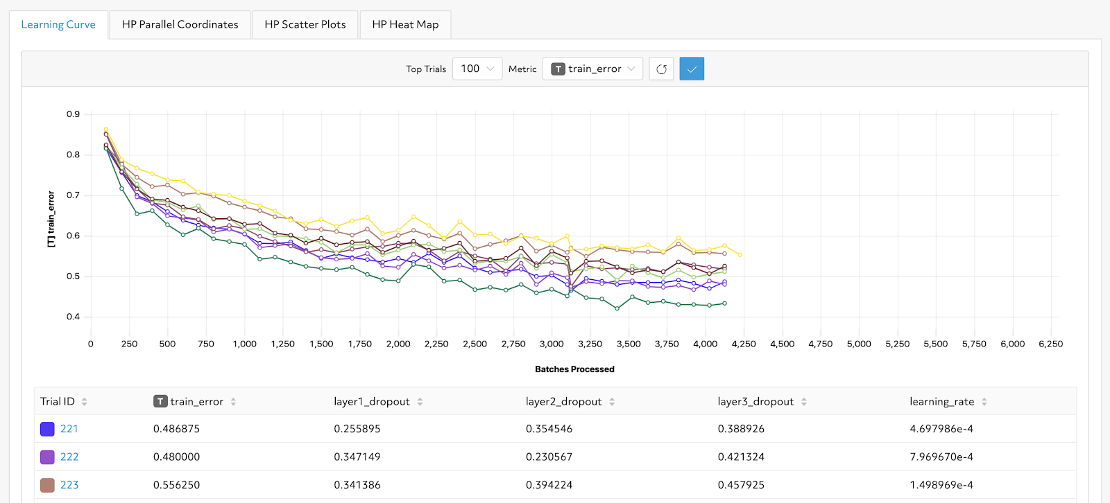
Learning Curve
The learning curve chart visualizes the performance based on the metric of interest for each trial over the number of completed batches. This provides a straightforward comparison between trials and sheds light on why certain trials were stopped early during an adaptive experiment. While Determined already provides learning curve visualizations through TensorBoard, our native implementation allows you to directly reference your trials without leaving the application. For instance, if a particular line in the learning curve is interesting, you can easily learn more about the trial by finding the corresponding entry in the Trial table and navigating to the Trial details page.
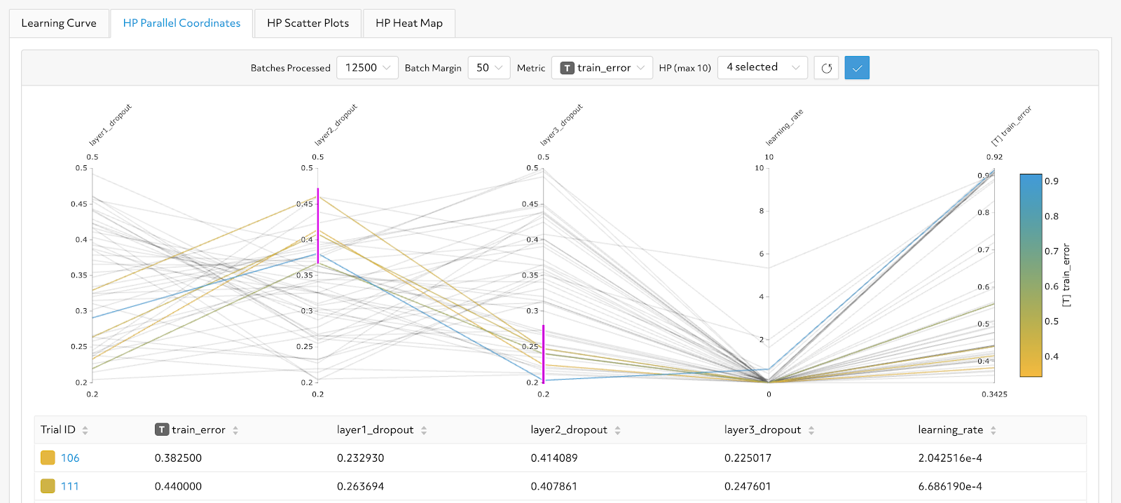
Parallel Plot
Parallel coordinate plots are a convenient way to view high-dimensional data with different scales. Here, we use a parallel plot to illustrate the relationship between hyperparameters and metric performance. In the example below, by adding filters on two specific dimensions (the pink lines shown below), we isolate trials that use a high layer2_dropout and low layer3_dropout to observe the range of training error achieved. Lines colored by metric of interest serve as an additional signal, allowing you to quickly visualize if the filtered range of parameters provides good (blue) or poor (orange) performance.
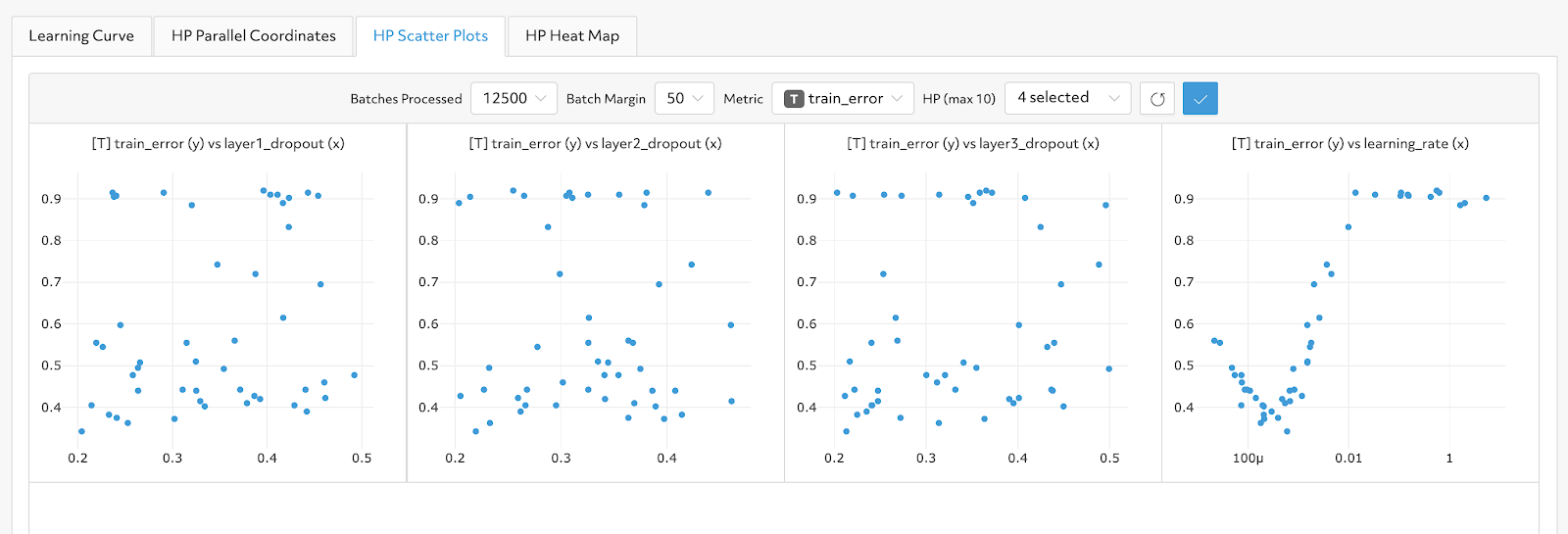
Scatter Plot
Each scatter plot reveals the relationship between a single hyperparameter and a single metric of interest. For example, in the right-most graph below, we see that as the learning rate increases, the training error increases. Exploring relationships like this will allow you to run more specific searcher experiments to further optimize your model’s hyperparameters.
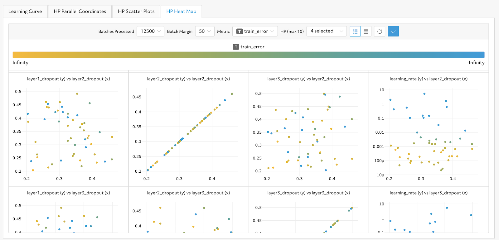
Heatmap
Heatmaps reveal correlations between two hyperparameters and metric performance. Each axis represents a hyperparameter, while the color is based on metric performance. For example, a heatmap could show there is a relationship between learning_rate and layer2_dropout.
You can find these visualizations in Determined versions 0.14.3 and above. The plots are currently supported for random, grid, and adaptive hyperparameter searches. More information on Determined and hyperparameter tuning can be found in our documentation. If you have any questions or suggestions, please join our community Slack or visit our GitHub repository – we’d love to help!